Closer
A heartfelt solution for long-distance relationships
ROLE
User research
UI Design
UX Design
Usability Testing
TOOL
Figma, FigJam
Duration
May - Oct 2023
Agency
Springboard
UX Career Track

Overview
Closer is a mobile app that offers a unique photo-sharing experience that brings partners together. What sets Closer apart is its innovative approach to keep long-distance conversations alive through customizable avatars, a unique competition system, and effortless photo sharing and comments, all aimed at keeping couples emotionally connected, no matter the physical distance that may separate them. In this case study, you'll journey through the step-by-step process of building this app from scratch, exploring how it redefines the dynamics of long-distance relationships in the digital age.


PROBLEM SPACE
Long-distance relationships are hard but often inevitable
Long-distance relationships, affecting 28 million individuals in the U.S. and resulting in a concerning 42% breakup rate, undeniably pose a major challenge. Life often leads people to different places for reasons like business trips, family visits, education, etc. The physical distance can trigger issues such as communication problems, trust issues, a lack of physical intimacy, and uncertainty about the future. These challenges strain relationships and, in many cases, lead to their end.
INITIAL PROBLEM STATEMENT
How might we reduce the stress and improve the communication in long-distance relationships?
When couples face the pressures and challenges of long-distance relationships, stress can cause them to drift apart. Recognizing this issue, I aim to develop a communication tool specifically designed to enhance the connection and interaction for couples navigating the complexities of long-distance relationships.
SECONDARY RESEARCH: STATISTICS
To gain profound insight into long-distance relationships, I first conducted secondary research on the current available findings and statistics on Long-Distance Relationships.

PRIMARY RESEARCH: USER INTERVIEW
Users find communication in long-distance relationships to be burdensome
I conducted remote user interviews with individuals who have experiences with long-distance relationships to better understand:
Users’ general feelings toward long-distance relationships
What problems users encounter in long-distance relationships.
How are user dealing with these problems and conflicts in long-distance relationships.
The Key factors to the success/failure of users’ long-distance relationships.
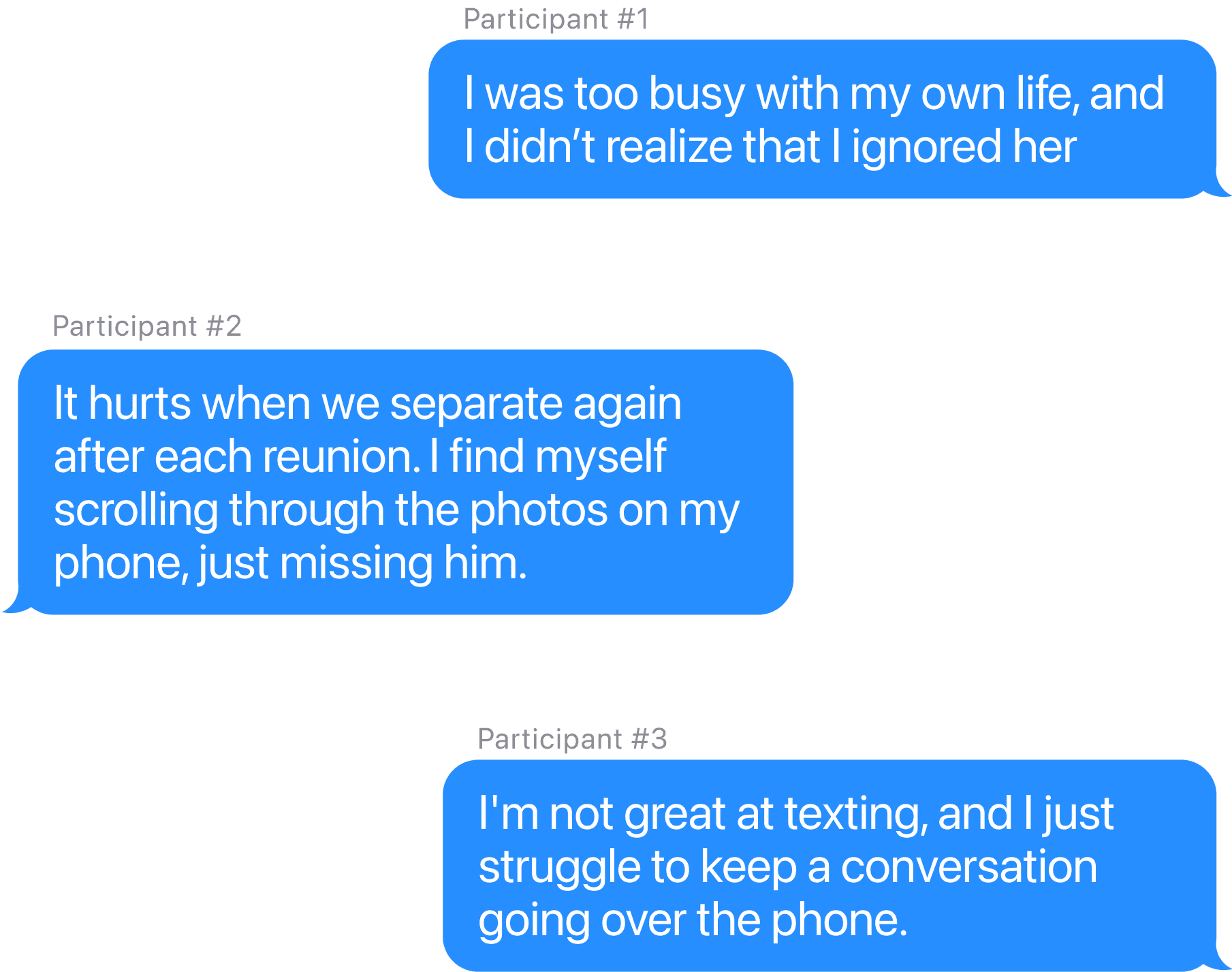
Key Insights
Time-consuming
Communication in long-distance relationships tend to be time consuming and inconvenient, so users avoid long-distance communication
Less in common
Living separate lives, users often find themselves lacking common topics with their long-distance partners, and that's when things start drifting apart.
Current apps
Users haven’t found a mobile app that makes long-distance communication convenient enough for them.
USER STORIES
MVP: Increase interests, reduce longliness, and improve communication
I gathered insights from the User interviews and wrote down some user stories, which are divided into the MVP, and the next release.

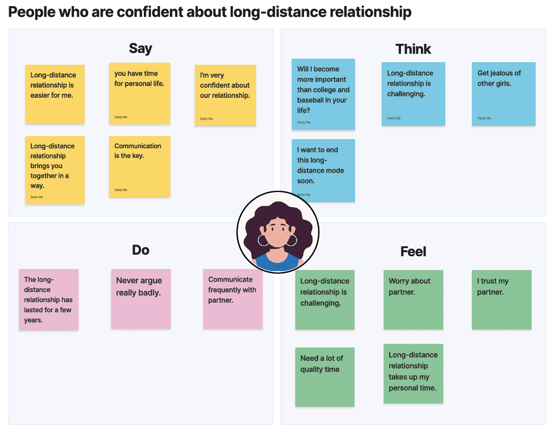
EMPATHY MAPS
What do users say, think, do, and feel?
Based on the user stories, I have divided users into different types: individuals who are afraid of long-distance relationships, and those who are confident about long-distance relationships.

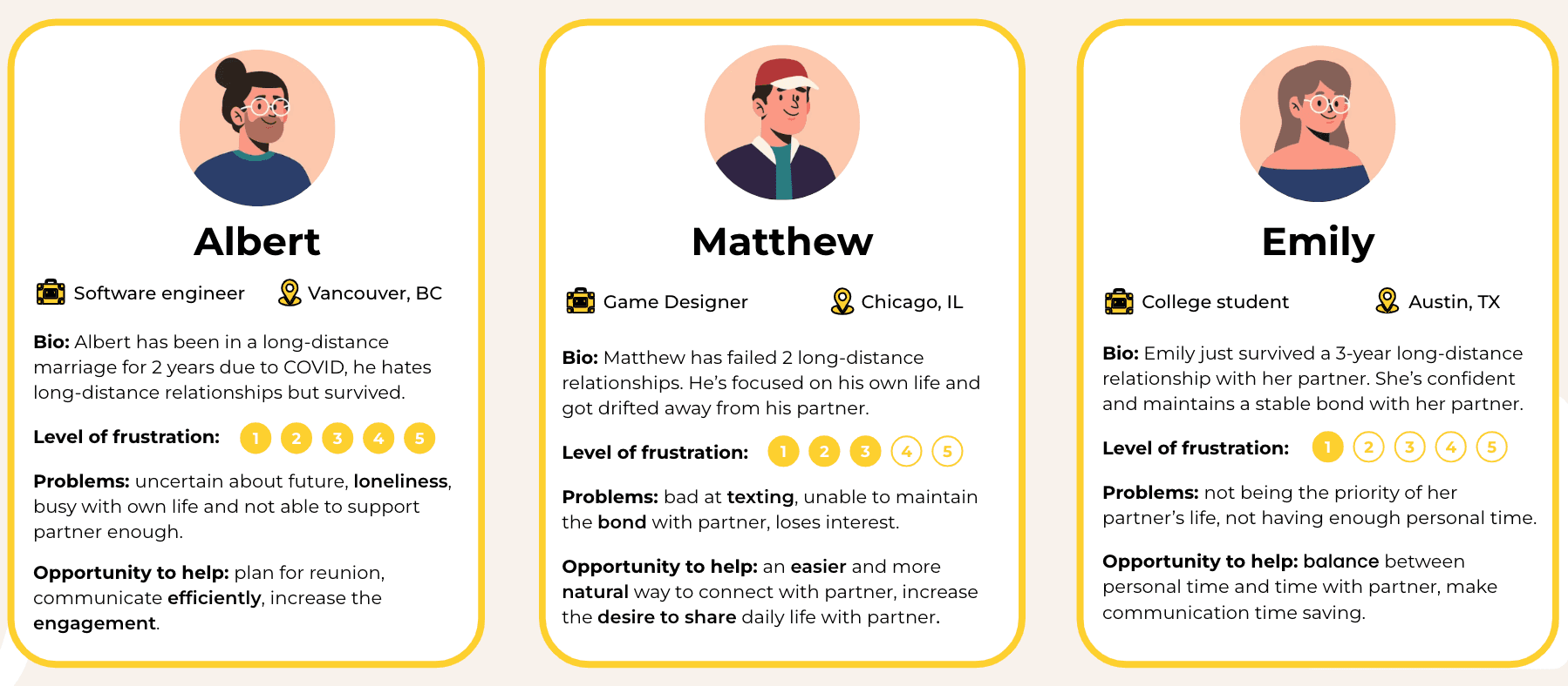
PERSONAS
Who are we designing for?
I developed three personas, outlining their background, user needs, and problems.
REDEFINED PROBLEM STATEMENT
How might we make communication in long-distance relationships a quick, easy, and habitual process for couples, while encouraging more interaction?
After learning from both research data and user interviews, I focused on a significant problem within long-distance relationships: communication. Specifically, the challenge is to make communication quick, easy, and straightforward. The goal is to turn it into a habit for users, encouraging them to regularly share their daily lives and thoughts with their partners.
SOLUTION IIDEAS
In response to the problem statement and with the mission of addressing user needs, I brainstormed potential solutions to resolve user problems.
Shared Photo Album
Couples can capture photos, store memories in a shared album, and comment on each other’s moments—effortlessly staying connected across any distance.


Sticky Notes
Couples can bridge the distance with personalized daily notes and virtual post-its—jotting down thoughts, sharing emotions, and capturing everyday moments in one effortless digital space.
Overview of partner’s surroundings
Couples can access real-time insights into their partner’s world—local time, weather, news, and even mood—bridging distance with a deeper sense of presence.

FINAL SOLUTION
Closer: An Effortless Photo-Sharing Experience for Long-Distance Couples
After exploring different solutions, I chose photo sharing as the core feature—because a picture is worth a thousand words. I named the app Closer to give long-distance couples a private space to stay connected. Even when words fall short, a simple daily photo can spark conversation naturally and effortlessly.
FEATURE IDEATION
The challenge of improving communication in long-distance relationships is inherently intangible—hard to see, touch, or measure. To address this, I adopted a guiding principle: translating the intangible into quantifiable data, which shaped every step of the app’s development.


USER FLOWS
User Flow #1: New users creating a new account

User Flow #2: Existing users share / reply to photos

WIREFRMING
Sketches


Low fidelity wireframes

TESTING ROUND 1: GUERRILLA USABILITY TEST
Initial round of usability testing on low fidelity wireframes
I conducted my initial usability test, specifically a Guerilla usability test on the early wireframes, in order to collect early user feedback. I assigned users with a simple task: share a photo with their partner using the app. The feedback revealed important insights.
Lack of instruction on home page layout
Users got distracted by the graphs and had trouble finding the main feature on the home page because it didn't provide clear instructions and calls to action.
Confusion with the point system
Users had difficulties understanding how the relationship index (point system) works, and how it connects to user actions.
Need for more engagement
Users appreciate the concept of sharing photos between couples but desire increased engagement within the shared photo album feature.
VISUAL DESIGN
Mood Board
I planed to use a warm color pattern to convey feelings like: I plan to employ a warm color palette to evoke emotions such as warmth, comfort, romance, coziness, intimacy, and relaxation.

Style Guide
Color
Typography

DESIGN & ITERATION
Hi fidelity screens V1
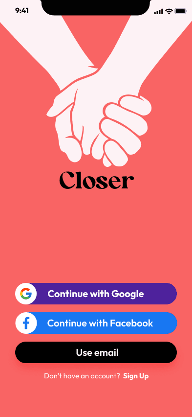
Splash
Use the “holding hand” vector to convey that it’s a couple app. Offers different options for users to sign in or create a new account

Enter profile
An onboarding step allowing users to enter personal information.

Relationship Quiz
Gathers relationship information from new users in order to provide customized relationship score later on.

Home Screen
Introducing a relationship ring with several circles representing different factors affecting the relationship, followed by a to-do list showing users’ activities

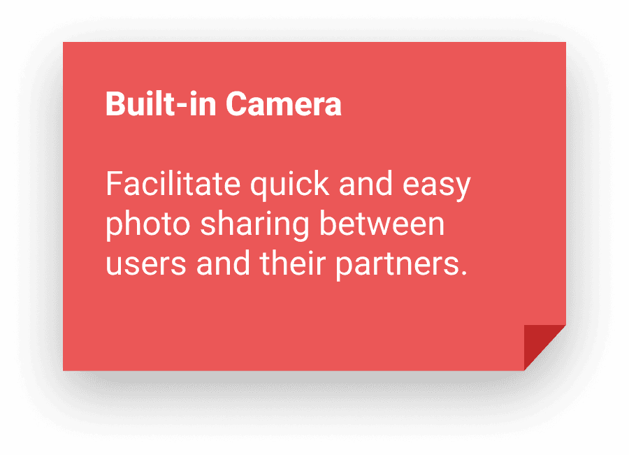
Built-in camera
Enables users to take photos and share with their partners easily, simplifying the “sharing life” process between couples.

Shared photo album
A private space for couples to store precious memories, with tags filtering different types of photos.
Hi fidelity screens V2
After some review with my peers, I iterated on my design and made some changes on the UI design.
Major changes
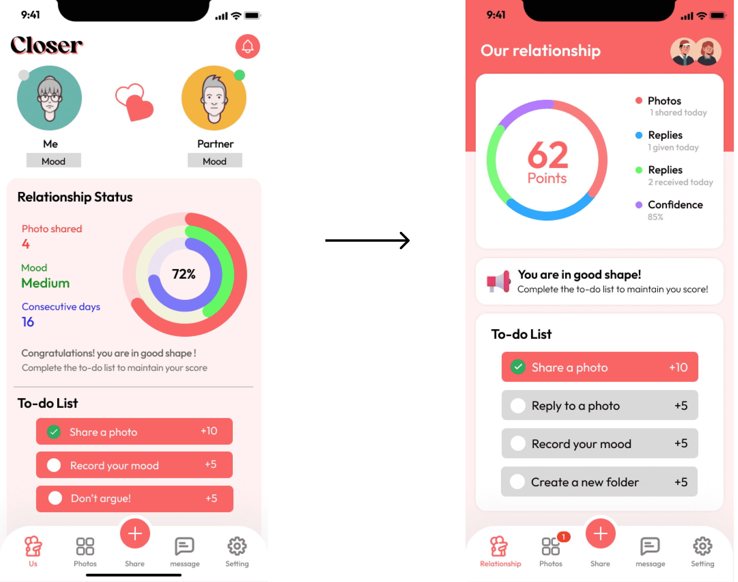
Simply the point system and clarifies the to-do list
I simplified the multi-circle ring to a single circle with different colors, and I intentionally lower the relationship score to “62”, in the purpose of prompt users to complete the tasks below to earn some points. In the to-do list, I change the color of undone items to gray in order to show the contrast between finished and unfinished tasks.

Have just one quiz question per screen
It’s visually heavy with all four quiz questions crawling tightly on one screen. Instead, I separated the questions and put one on each page, leaving more space for users making selections and a better readability.
TESTING ROUND 2
Feedback #1
Mixed feeling toward the point system
User feedback on the relationship point system
60% negative feedback
Users are afraid to see the number that represent their relationship status. As straightforward and easy it is for the developers to measure the success, it’s too intense for users and triggers negative feelings.
40% positive feedback
Participants who like the point system think it’s fun to play with and feel motivated to complete the to-do list in order to boost the score, which matches my expectation and intention of creating the concept of relationship points.

Feedback #2
Confusion with home screen functions
Users often experience confusion when navigating the home screen due to the diverse sections and functionalities it offers.
Feedback #3
Lack of uniqueness
User have questions like "Why should I choose your app over iMessage or iCloud?" Given that our app primarily provides fundamental features, it's important to enhance its distinctiveness.
Feedback #4
Built-in camera not obvious enough
We aimed to make the sharing photo experience fast and simple enough to form daily habits for users. However, the built-in camera feature did not prove immediate apparent for users, causing a potential usability challenge
FINAL SOLUTION
An immersive and effortless photo-sharing experience that bring you and you long-distance lover CLOSER.
Splash

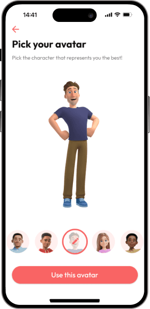
Customized avatars
Tooltips

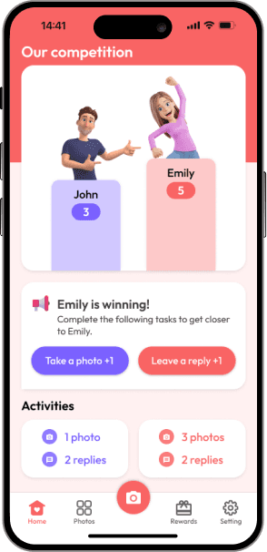
Competition Board
Rewards
FINAL USABILITY TEST
Feedback #1
Onboarding
Users find the onboarding process smooth and rarely encounter confusion. They particularly love the cute avatars and find the tooltips helpful.


Feedback #2
Competition Board
Users find the onboarding process smooth and rarely encounter confusion. They particularly love the cute avatars and find the tooltips helpful.
Feedback #3
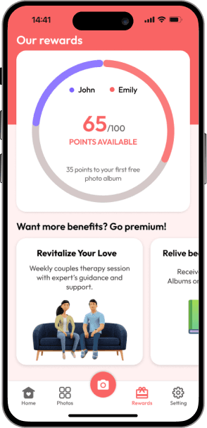
Monetization
In the rewards tab, users are confused about how the rewards system works but are interested in the monetization options.


For the purpose of this project and its time frame, I won't be continuing work on this app as I'm moving on to the next project.
REFLECTIONS
The uniqueness of long-distance relationships
The uniqueness of the topic I chose, long-distance relationships, presented both a challenge and a significant opportunity to deepen my understanding of users and solve their problems. As romantic relationships are deeply tied to emotions, users' experiences with my app are intrinsically connected to their personal lives.
Additionally, in order to measure success for this topic, I put a lot of efforts in transferring intangible feelings into tangible measurements.
Consider human emotion in product design
My experience in designing the ‘Closer’ app highlights a crucial aspect of user experience – how personal situations can shape how people feel about and use mobile apps. As product designers, it's our responsibility to recognize the intricate link between technology and human emotions. This approach helps us create a smoother journey for them, ultimately assisting them in achieving their desired goals.